Skill Development Platform

Perfecting the job search experience for job seekers on one of the largest job search platforms in India. (2 million+ users). Online job search is getting bigger as more and more job seekers tend to search for new jobs online through job search platforms. My role, as a UI/UX designer, was to improve the old outdated user experience.

Project Type

Team of 2

Role

Research, ideation, UI and UX design.

Duration

Early 2019 (1 Month)

Designing the job search experience

My role

I joined Monster team in 2019, at a time when the app was 8 years old, many features and enhancements had been brought in initially and there was no onboarding and the overall experience had issues.


Therefore my role was to act as a channel between all parts of the company to design for the user experience. From working closely with the users(Job seekers) and HRs to identify product opportunities, connecting with engineers to understand technical/hardware restraints, validating solutions, to checking in with support regularly to understand potential pain points among beta testers.

Needfinding to frame the problem

Interview

I followed up with user interviews to understand motivations, user behaviour and pain points of using the app. I conducted 5 interviews to know more about how job seekers search & apply when looking for job opportunities and what recruiters need to take a decision on the application.

Findings

  1. All users wanted to know more about the company and company culture before applying for jobs. Users trust job postings by companies more than job postings from recruiters.
  2. Mid to experienced job seekers liked to browse and get a quick overview of what the job market has to offer.
  3. Recruiters require more profile data to find the right candidate for the open position.

Learning from the competitors

Before beginning the design process, I analyzed competitors that provide similar services to Monster. I found that LinkedIn and Glassdoor did a good job of showing more information about the company, including reviews and role-based salary ranges.

Findings

  1. All the users wanted the salary details on job postings.

  2. All users wanted to know more about the company and company culture before applying for jobs. Users trust job postings by companies more than job postings from recruiters.

  3. Mid to experienced job seekers liked to browse and get a quick overview of what the job market has to offer.

Key Learnings

  1. The extensive registration/signup process before even starting to look for job opportunities is one of the biggest drawbacks of using the Monster app.
  2. On average, all the users took between 7- 10 mins to complete the sign up process. We also noticed that 50% of them skipped the sign up process mid way.
  3. The another biggest pain point was all the users found it difficult to differentiate between jobs posted by companies and recruiters.

Building empathy

Using qualitative data based on the observations that I got from the interview. , I defined two persona Sara (Business Analyst, 34), Akhil Newman (Fresher, 23) to better empathize with my main user groups and prioritize goals according to their needs.

User Flow

These findings came from an earlier discussion with participants regarding their job search experiences and journey, following which I began outlining the product flow that provides users with a great job search experience.

What did we improve

Onboarding Experience

A good onboarding process can solve many problems. Research shows that many problems occur at this stage. In our new onboarding process, we offer users the option to upload their resume or create a profile by filling in their details. Uploading the resume automatically fills in all the profile details and reduces the user’s hassle. This increases overall completion of the candidate profile, which helps recruiters access the necessary details more easily.

Search

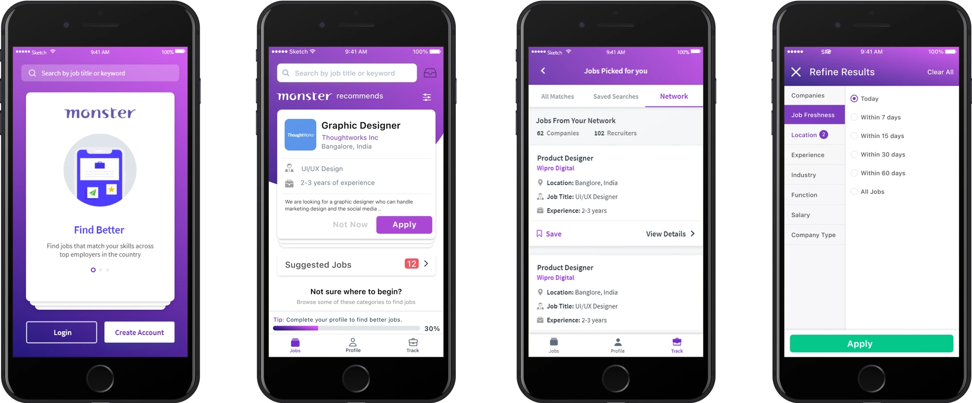
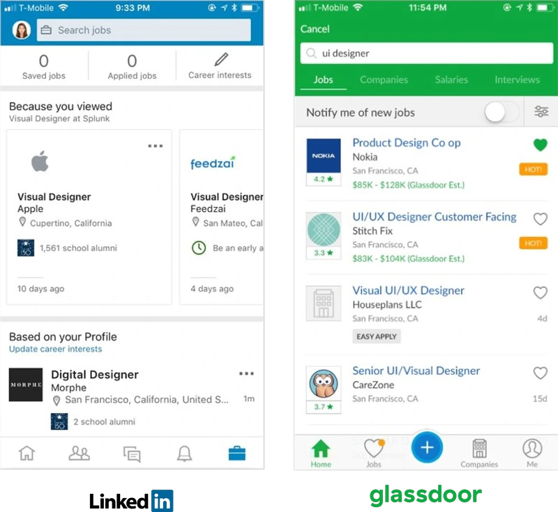
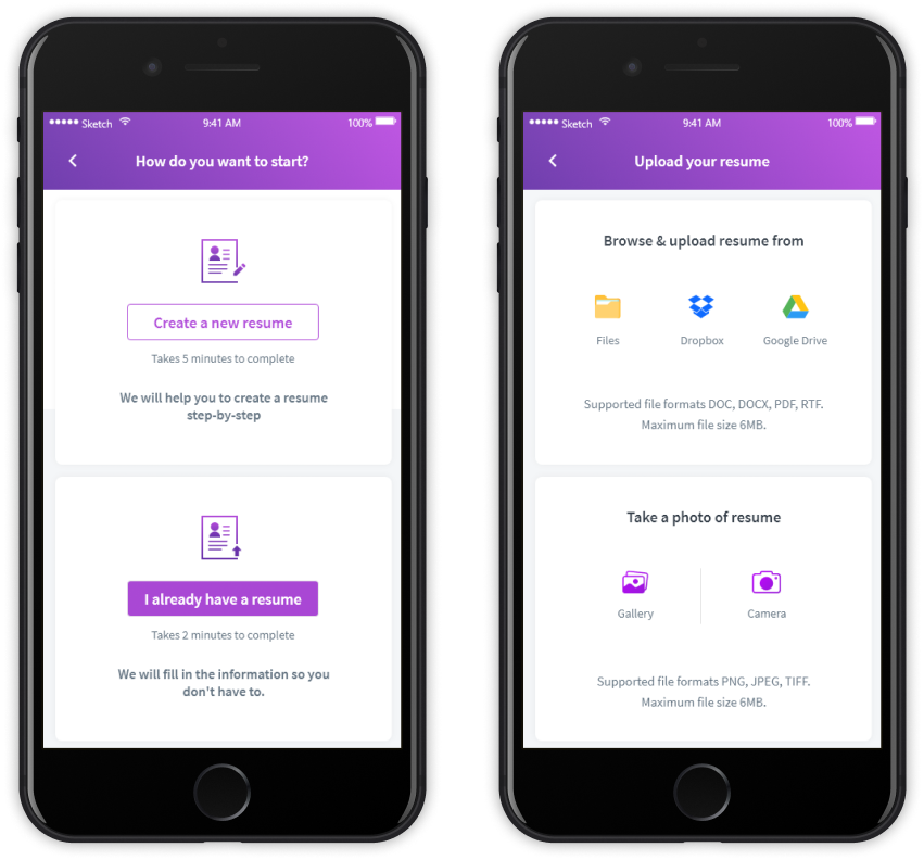
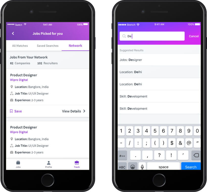
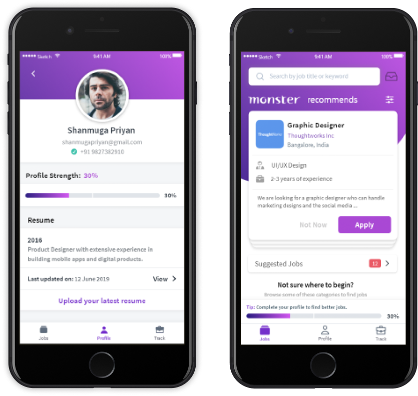
To enhance discoverability, I utilize an expanded search bar. Users can search by job category, company name, and location. The app displays the most relevant results based on the user’s keyword. Users can view essential job details such as company name, location, job title, experience requirement, and a short description. The job cards can be swiped right to apply or clicked to apply now.

Job Details

Users can view job and company details as well as other open positions in the desired companies. Additionally, they can save jobs for easy access later from the track screen.

User Profile

Users can access the “Profile” screen from the menu bar and edit their updates. They can use the quick action links under each section to add their latest experiences or any updates. The Profile Progress indicator provides frequent tips and nudges the user to complete their profile, augmenting extrinsic motivation.

Company Profile

Users can navigate to a company’s profile by clicking on either the company profile picture or the name. Once on the company profile page, users can view all of the company’s details, job postings, and reviews. They can also save jobs for later access.

Measuring Impact

We conducted a final usability test with five participants and used the SUS usability scale to evaluate the results. The test included a series of tasks:
The test included a series of tasks:
1. Register and create a profile.
2. Apply for an entry level analyst role.
3. Search for jobs with a fixed salary range and find out more about the company.  
All five participants completed the tasks, and the revamped app received a score of 85 on the SUS scale. A score of 80.3 or higher is considered an A, indicating that people love the app and are likely to recommend it to their friends. Since the product update, there has been a significant increase in job applications, with the number of applications per user increasing from 5 to 20. In addition, there has been a 30% increase in new signups, and profile completion rates have increased by 40%.